Categories
Apple Design

On Jony Ive’s Departure

Ben Thompson[Stratechery]: “Again, though, I think Ive is in part a cautionary tale: he did his best work under Jobs, while the last few years have been more fraught from a design perspective; if Ive was not entirely up to the task of being the ultimate arbiter of all things Apple, who can be?”

That captures it for me. It always felt like after Steve Jobs passing Ive was free to do what he wanted. The checks and balances provided by Steve Jobs were gone. The obsession with thin and light was more pronounced than ever which lead to gluing components into the computer body making Apple designs less repair friendly.

Maybe that wasn’t Ive that decided to go thinner and lighter at the expense of all else? I have no idea, I’m just spitballing here. But Ive does get the credit and blame for all designs in the post Jobs era.

Categories
Design

Full Circle

I was cleaning up around my desk this afternoon, it’s a complete wreck most of the time and it’s been super bad for a while now, and I happened upon some notes I created somewhere in the mid to late 90’s.

Blue Skies PlaneEarly in my career, around 1988, I worked for a company called AgData and one of their offerings was a chemical tracking application called ChemTrak. It was a chemical use reporting tool for the State of California and I had a bit of a fascination with it. I always wanted to write a version for Windows.

That’s where the notes come in. I was writing down what I wanted it to do. It was a pretty simple list but it would’ve been a great little Windows app.

Now, Agrian, my employer, does all of that and a whole lot more.

Anyway, here are the notes.

The idea was to make it simple and extensible. I was going to create a plug-in architecture so someone would write a .DLL the main application would know how to load. On the database side I was going to use a standard dBASE file format so folks could write their own reports using standard tools at the time. Apparently — at the time — I thought Borland’s ReportSmith was a good idea for that.

After AgData I worked at Microsoft, then Visio for 10 years, then did video decoders for seven years. I made some other stops in between.

Now I’m back working on Agricultural solutions. Feels good.

Categories
Design Development

Higher

Quora: “Total cost for creating Tinder-like app for one platform would be about $5k – $10K.”

Charging $5-10$K for a Tinder-like application is how you go out of business. I’m speaking from experience here.

Watch out for the blowfly.Back in 2014 I made my second run at freelancing. This time around I failed. I learned a lot about who I am and how not to  run a business. Two of the primary reasons were charging too little for my work and not being a blazing fast coder.

I’m going to step out on a limb here and park a Tinder-like app — a service really — at around $100,000.00, not 10.  Call me crazy, it’s fine. Let’s take a look at some estimates given by folks that have actually built some great software.

First up, Craig Hockenberry: “With such a short schedule, we worked some pretty long hours. Let’s be conservative and say it’s 10 hours per day for 6 days a week. That 60 hours for 9 weeks gives us 540 hours. With two developers, that’s pretty close to 1,100 hours. Our rate for clients is $150 per hour giving $165,000 just for new code. Remember also that we were reusing a bunch existing code: I’m going to lowball the value of that code at $35,000 giving a total development cost of $200,000.

Emphasis is mine.

In the same Stack Overflow post we find Jonathan Wight weighing in on the cost for the Barack Obama App: “The Barack Obama app took 22 days to develop from first code to release. Three developers (although not all of them were full time). 10 people total. Figure 500-1000 man hours. Contracting rates are $100-150/hr. Figure $50,000-$150,000. Compare your app to Obama.app and scale accordingly.”

Both of these guys are world class software engineers. I have no reason to doubt their estimates because they have the experience needed to build any application.

Here’s Kyle Richter of the excellent Martian Craft: “In February 2013, the average cost of a house in the US was $152,000. By our estimates inside of MartianCraft, the average cost of an app is approximately $120,000.

If you want a high quality application be prepared to pay for it. Sure, you might be able to get your Tinder-like experience for $5-10K, but it may behave and scale like a $5-10K application and service.

Know what you want and what you’re getting into before you talk to developers about building your dream application or service.

Categories
Design

Apple Park Design

The Wall Street Journal: “A section of workspace in the circular, Norman Foster–designed building is finally move-in-ready: sliding-glass doors on the soundproof offices, a giant European white oak collaboration table, adjustable-height desks, and floors with aluminum-covered hinged panels, hiding cables and wires, and brushed-steel grating for air diffusion.”

Like so many people I couldn’t wait to see the inside of the new Apple Park building. From the outside it’s absolutely amazing. But the inside appears to be stark, cold. Of course this is my opinion and I haven’t actually been inside the building, which could change my mind because experiencing something for yourself can make a world of difference.

I hope you like white, stark, and cold?

I happen to have some recent experience moving into new digs. Agrian just completed construction on our new building and we moved in a couple months ago. By contrast our building is inviting, not stark. It has a design I’ve never experienced and I love it. Our building is basically split down the middle by common space. The main entrance is in the middle of the building, which is a rectangle, not a circle. That main entrance opens to a long hallway which ends in The Hub. It’s the heart of the building. It’s a reconfigurable space with a great kitchen on one side. The wall opposite the kitchen holds giant monitors stitched together. Yes you could play games on it, watch your favorite TV show, or whatever! It’s a great feature. Most of the time The Hub is configured with tables and booths so we have a place to eat together.

“Desks in the open-plan workspaces can be raised to standing level at the push of a button.”

Open workspaces? Ack.

Another feature of the new Apple Park space I’m not a fan of is open workspaces. I’ve worked at companies with open spaces and private offices, I prefer private offices. That allows me to make the space mine. The new Agrian building has a great layout, with private offices, fully adjustable desks, and big displays. Perfect.

I really need to take some pictures and share them. Another design choice I appreciate in our space is the use of texture throughout.

The only picture I’ve taken is of our exposed Server Room. It’s super easy for a server room to become messy. An exposed server room is a great way to embarrass folks into keeping it clean.

Our new server room. Nice and clean.

I’ve found over the years my environment affects my mood. I’d love to see Apple Park in person. It may be absolutely perfect, but from the article it doesn’t look like a place I’d fall in love with.

Does anyone else think it’s strange a design focused company like Apple didn’t locate in the middle of a city? I am. I don’t know why, but I am. Their new space is beautiful but was entirely too small for the company before it left the architects office. It only houses 12,000 people. For some reason I think Tony Stark when I think Apple. The Stark building in the Avengers seems Apple-like to me —with the exception of the big Stark lettering and it should be in San Francisco, not New York.

I could see the Apple logo in place of the Stark name.

I wonder if they’ll have tours at Apple Park? I’d like to check it out and see if my opinion changes.

Categories
Apple Core Labs Design Development Indie iOS Mac Windows

Passion Project: Mixing C++, Objective-C++, and Swift

I know a lot of folks have had to go through the process of bridging to C++ so you can use it from Objective-C or Swift. In my case I’m using it from Swift, so I thought I’d share what the middle Objective-C++ layer looks like. If you’ve done any Objective-C it will look like straight Objective-C, until you look a little closer. That’s when you’ll notice a C++ namespace, new, and delete statement. This code is a straight passthrough to the underlying C++ code — it’s here so Swift code can communicate with the C++ code.

Here’s the code that bridges to our Creatinine Clearance calculation.

You’ll notice a class called PKMConvert that has a class method called genderFromPKMGender. I created a set of mirror enums. One on the iOS side the enums use NS_ENUM syntax, on the C++ side they’re straight C style enums, so this code converts between the two. It’s just a simple mapping.

Another thing you’ll notice is I’m still using “old” C++ syntax to create and destroy objects. I’ve been thinking about updating the syntax to C++11 so I’d use unique_ptr instead. We’ll see if that happens. It’s not a big deal.

Something I’ve been mulling over is releasing the entire PKMath C++ Library as an open source project once I have it working for iOS/Mac, Android, and Windows. I don’t know that it would be overly useful for anyone, but there you go.

Since I haven’t actually written any Swift code in the new RxCalc to use the Objective-C++ code I thought I’d share one of my unit tests for the Creatinine Clearance example above.

Here’s how the different layers look from 30,000 feet. I like pictures, don’t you?rxcalc2layers

Categories
Adobe Cloud Design

Adobe’s Comet

Adobe Creative Cloud Blog: “Over the years, we’ve learned a lot about what you need and have created tools so you can deliver your best design work. As technology has changed, so has the way that you approach your work. Instead of one screen, you now have to think about multiple screens and how the experiences you’re creating relate to each other.”

This looks like an awesome new entry in the Adobe Creative Cloud Suite. I’m sure many designers would like the ability to create a design, hook it up, and demonstrate it in the correct context of the device.

The video below focuses on a mobile application and how a designer may use Comet to quickly try new transitions between views. It looks like a real winner.

Adobe has a great track record of providing cross platform tools. I wonder if Comet will run on Windows and Mac, or have they made a clean break and focused on one platform?

Categories
Design Indie Weblogging

Six Colors Redesign

Six Colors 6C logoSix Colors: “Anyway, the goal of the design—other than, perhaps, to better reflect the site’s name—was to differentiate between the different kinds of posts we have on this site. There are regular posts, sure, but we found ourselves also posting off-site links, links to work we’ve written on other sites, links to podcasts, and posts from sponsors. Now those are all more clearly defined, and I think the site’s better for it.”

Absolutely beautiful. I love the treatment given to different post types.

Categories
Business Design

Teehan+Lax+Facebook?

Teehan+Lax: “Ultimately, the things we would get to do at Facebook, the people we would get to work with, the problems we get to solve were too compelling to say no to.”

While I’m not a fan of Facebook I can’t blame anyone for “selling out” to them, but this deal is strange. Basically the Teehan+Lax principals just shuttered their company so they could go to work for Facebook.

In a nutshell “the people we get to work with” at Facebook are better than the people we hired and work with every day, so we’re just going to move to Menlo Park and enjoy the good life.

That, of course, is a bit harsh, but it sure reads like that’s what went down, doesn’t it?

From one of their employees, on Twitter.

https://twitter.com/derekkinsman/status/556102474625720320

Also, why wouldn’t Facebook offer everyone a position, or at least give them the opportunity to take a position in California? It all seems very slimy.

The one thing I learned while freelancing, people will try to get you to do work for nothing. Facebook obviously pulled off quite a coup, without having to purchase an entire company to get what they wanted.

It also sounds like they had reached an inflection point. They obviously didn’t like dealing with the day-to-day garbage (who can blame them) and they wanted to do the interesting stuff. Can’t fault them there.

https://twitter.com/derekkinsman/status/556098484953432068

In the end the Teehan+Lax partners did what was best for them. I just feel bad for the 40 folks left standing in the cold of a Toronto winter wondering what just happened, and what do they do next?

https://twitter.com/derekkinsman/status/556144070742269952

Categories
Design Family

Mr. Fredricksen

Mr. Fredricksen, by Taylor Fahrni

Categories
Apple Design Development iOS iPad iPhone

iOS 7 Lowers the Bar

iOS 7

A gift for you!If you’re an iPhone or iPad user Apple had a shiny new gift for you this week; iOS 7. I know, I know, it’s a bit of a jolt. I won’t lie. I hated it for a few days, but it’s beginning to grow on me. I’ve heard this time and again “Give it a few days.” I’ve given it a few days and it still seems a bit stark, but overall I’m happy with it. My trusty iPhone 4 seems much faster than it did with iOS 6. Bonus.

Benefit to Developers

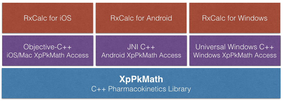
I’ve written a few iOS apps over the last few years. Some have been lovingly designed by professional designers, others, like our own RxCalc were kept intentionally simple. Why? Truth be told Jay and I don’t possess the ability to make beautiful imagery for our app, so the design has to be simple. We developed our app using plain old UIKit, it works really well, is fast, and the binary is tiny.

With iOS 7 the bar has been lowered. A generic looking application looked fresh when iOS hit the streets. There were developers that created their own style and look, and, in turn, third party developers began to define the look of the OS, not Apple. Think about developers like Iconfactory, Tapbots, and Path. They all introduced applications that took the look and feel of applications way beyond standard UIKit, and that’s great. They stood on the shoulders of giants and moved the bar higher so the rest of the app ecosystem had something to reach for.

Third party developers created Pull to Refresh, the Hamburger and the Basement, and alternatives to UITabBar. All were very good innovations and gave us beautiful, very functional, applications. But there is a downside.

If you go against the Apple playbook, which isn’t a bad thing, you may end up creating something that doesn’t feel at home on a future release of an OS. Since iOS 7 shipped I’ve seen numerous folks comment about how outdated forward thinking and innovative applications like Tweetbot look.

I’m sure we’ll see an update for Tweetbot soon, but the point is, if your app has a completely custom UI it may take a lot of time and effort to make it look right in iOS 7.

Back to RxCalc and our choice to use UIKit, without custom design elements. Here’s how RxCalc looks on iOS 6 and prior, and it looks this what on iOS 7 before being recompiled:

RxCalc, UIKit for iOS 6 and older.

It’s not flashy, but it looks similar to Apple’s own Settings app, or Mail, on iOS 6.

Making an app new again

If you created a simple UIKit application your road to iOS 7 is simple. Most of the hard work has been done. You can recompile and your application looks new again.

Here’s what RxCalc looks likes when it’s recompiled with the iOS 7 SDK. No additional work, just a simple rebuild.

RxCalc, UIKit for iOS 6 and older.

Can it be spruced up a bet? Sure it can, but I can put this in the store today and it will look like it belongs.

That’s why I tweeted this a few days back:

It is super easy to get a fresh UI if you stuck to generic UIKit.

Reset

The bar has been reset, time for a new generation of user interface innovation.

Thanks, Apple.